🔅 I had boring data, I made it better. ep 21

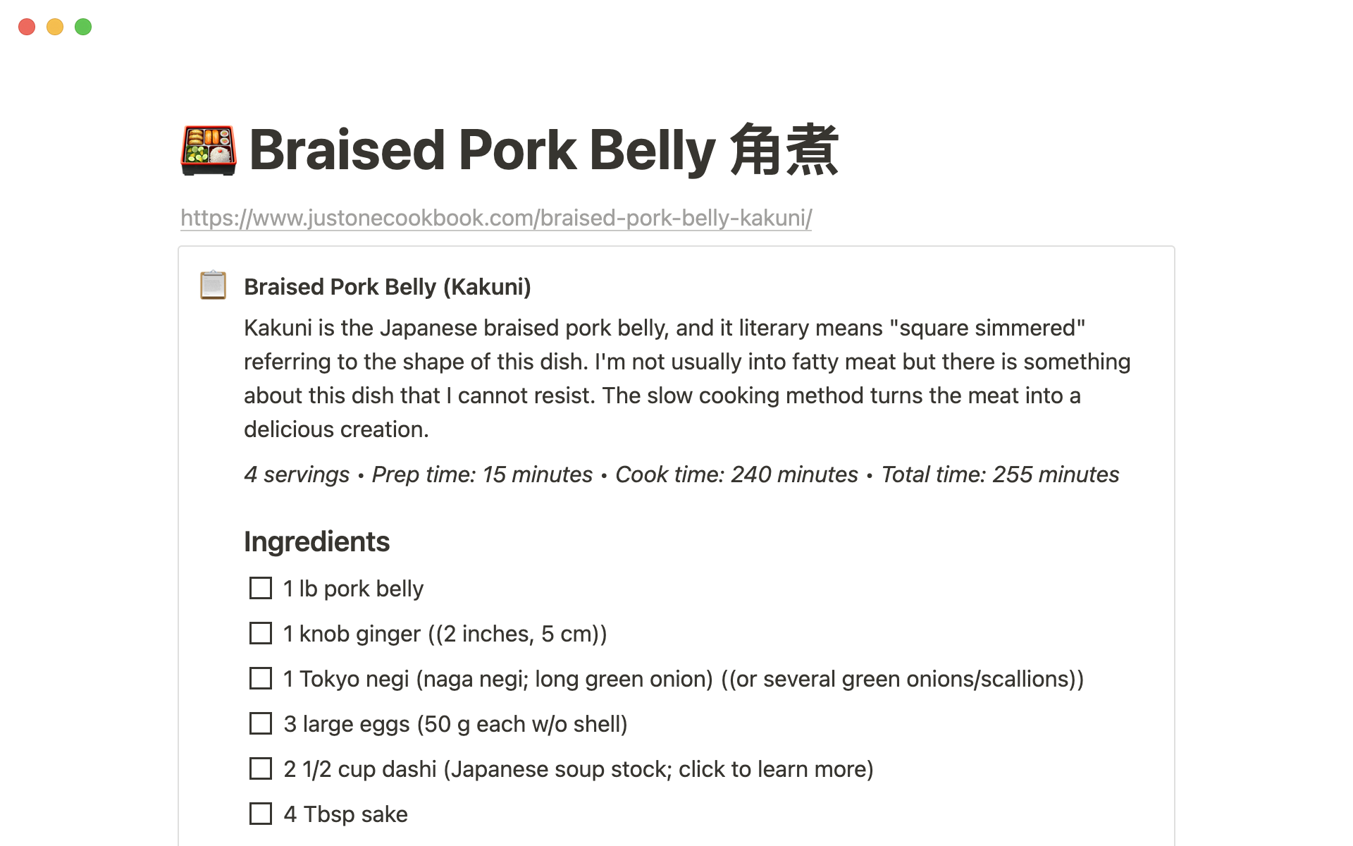
notion 🗒
Perhaps one of the best new features released on notion was the recent update to the web clipper is the new "pull recipes" functionality. If you are like me and are using notion for basically everything these days, from habit tracking, learning, marketing, and even planning parties you'll be thankful for this new update.
Visualizing data in 3d 🔅
While participating in the #30DayMapChallenge on Twitter, I was drawn into this very interesting dataset. Speed bumps for the City of San Antonio. Sure it sounds boring, but it really was interesting. But how do you show something like speed bumps in a way that engages with an audience? Thanks to the San Antonio Open Data Portal, I was able to pull this data. I then used terf.js to create hex bins and qgis to clean everything up before making a Mapbox style.
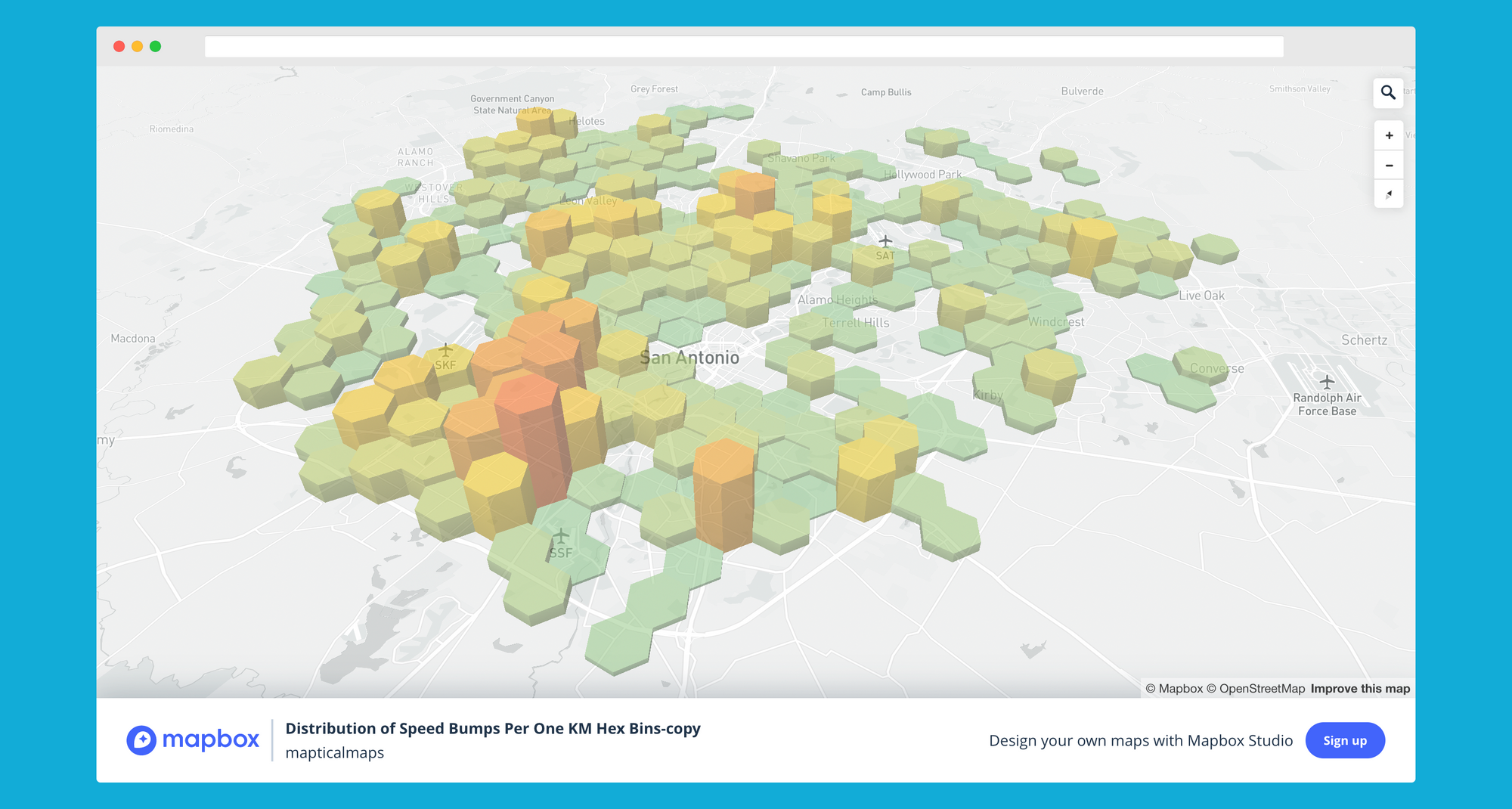
Be on the lookout for the full writeup this week! But for now feel free to take a tour of the working application.
stack overflow 💾
Ever tried to filter features from coordinates using mapbox-gl and mapbox gl draw? Seems like this question is asked a lot in geospatial development, so here's a simple solution with some great context.

on the playlist🔮
as the seasons change, it's time for Jimmy Eat World, more specifically, the Futures album. Perfect for a cool evening drive with the windows or a quiet read as the light fades.